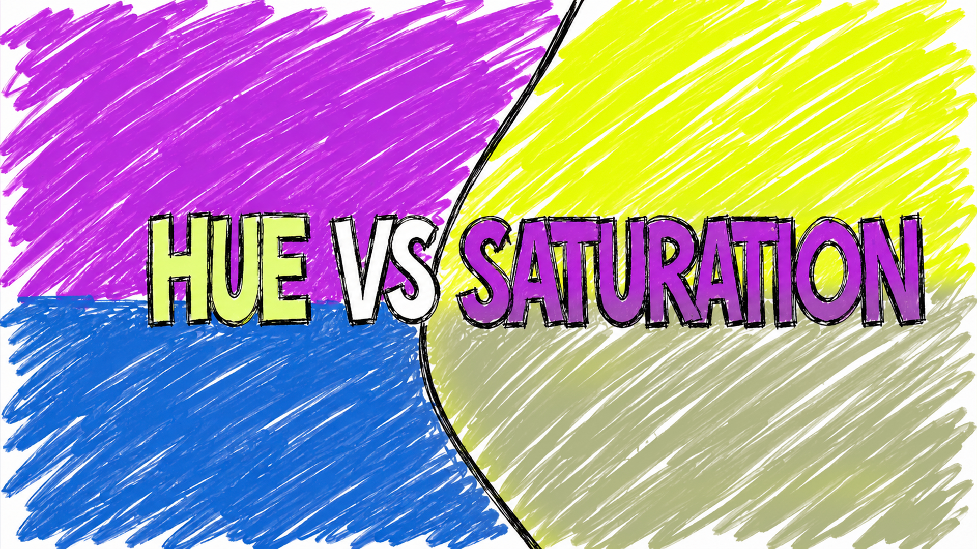
Hue Vs Saturation: What's the difference
If you're working with color, two of the first properties you'll encounter are hue and saturation. They may look similar, but they control different aspects of color. This quick guide explains each, shows how they interact, and gives practical tips for when to tweak one or the other.
What is Hue?
Hue is what most people mean when they say "color". It identifies the position on the color wheel — red, blue, green, yellow, and everything between. Changing the hue is like spinning the wheel: a red becomes orange, then yellow, then green.
Use hue to change the actual color of an element. Designers shift hue when they need to match a brand color, explore color variations, or adjust for different visual moods.
What is Saturation?
Saturation controls how intense or muted a color appears. A fully saturated color looks vivid and pure; a desaturated color looks grayish. Think of saturation as the amount of pigment in the color (or how colorful a color is. Makes sense?)
Use saturation to control emphasis and hierarchy. High saturation draws attention; low saturation recedes and supports other elements.
How They Work Together
Hue and saturation are independent but complementary. You can keep the same hue while changing saturation to get anything from a neon shade to a soft pastel.
Practical Design Tips
- Keep skin tones stable: Small hue shifts can make skin look unnatural; prefer slight saturation adjustments for subtle warmth/coolness.
- Use saturation for emphasis: Reserve high saturation for focal points (calls to action, primary illustrations) and lower saturation for backgrounds and supporting UI.
- Test at scale: Desaturated colors can read differently at small sizes or from afar — preview icons and text at real sizes.
- Avoid hue shifting for accessibility: Changing hue alone can break color contrast relationships; when adjusting for contrast, tweak lightness and saturation too, and check with contrast tools.
- Create palettes with a shared hue: Use consistent hues with varying saturation to build cohesive, layered palettes (e.g., brand hue + muted neutrals + one saturated accent).
Quick Notes
- In Photoshop: use a
Hue/Saturationadjustment layer — leave Hue at 0 to only alter saturation, or move it to shift color families.
Simply put,
Hue names the color; saturation controls its intensity. Mastering both gives you precise control over mood, emphasis, and visual hierarchy. When in doubt, ask: do I want a different color, or the same color with more or less energy?
Have you learned something today?
Share this post
Even though it's not the most confusing concept in design, a number of people still find it hard to differentiate. Here's the difference between the two
Related Posts
-
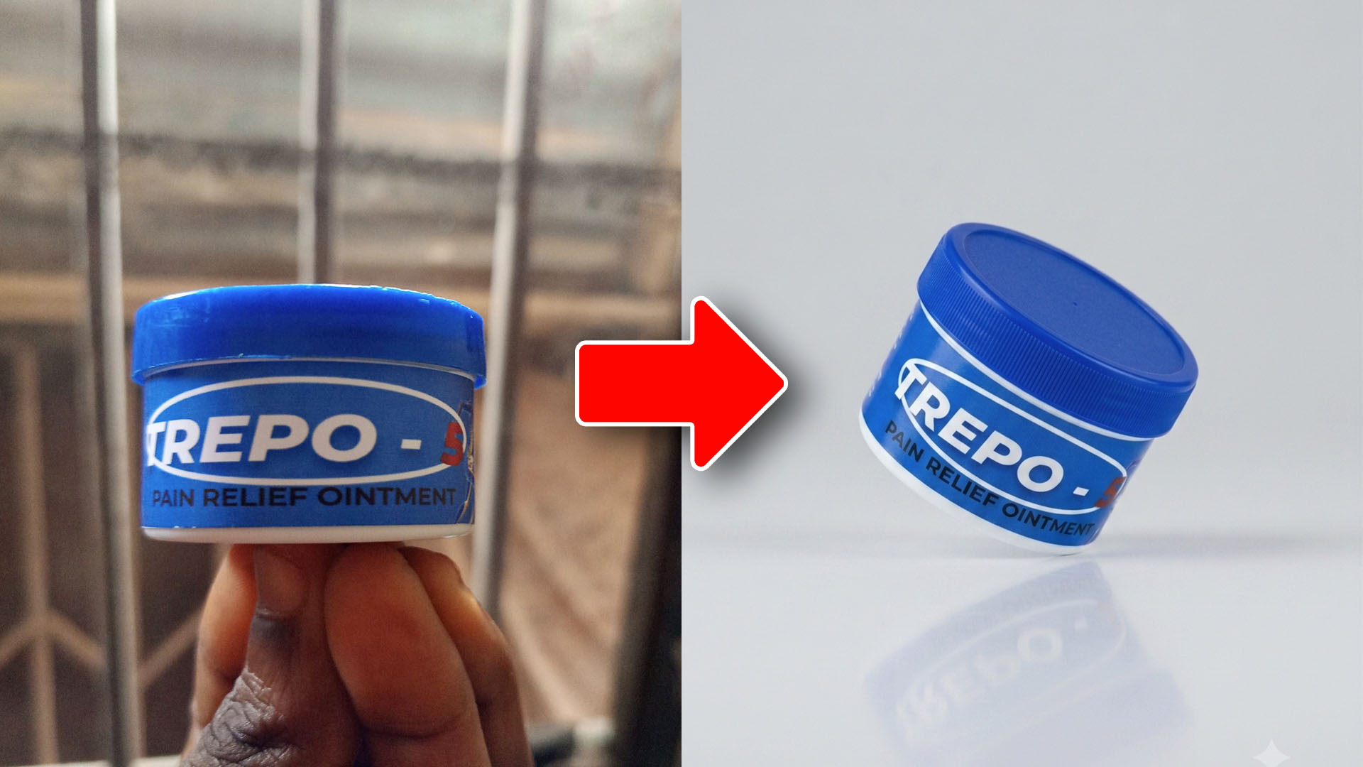
How AI Image Generation Fits Into My Design Workflow
A quick look at how AI image generation speeds up creative work, using a real before-and-after example and the simple prompt behind it.
Jul 23, 2026 -
What I Finally Understood About Graphic Design
The biggest improvement in my designs didn't come from learning Photoshop. It came from asking one simple question before I started designing.
Jun 15, 2026 -
What I Didn't Understand About Graphic Design
For years, I thought graphic design was about making things look cool. The result was cluttered, confusing designs and a lesson that changed how I see design today.
Jun 8, 2026