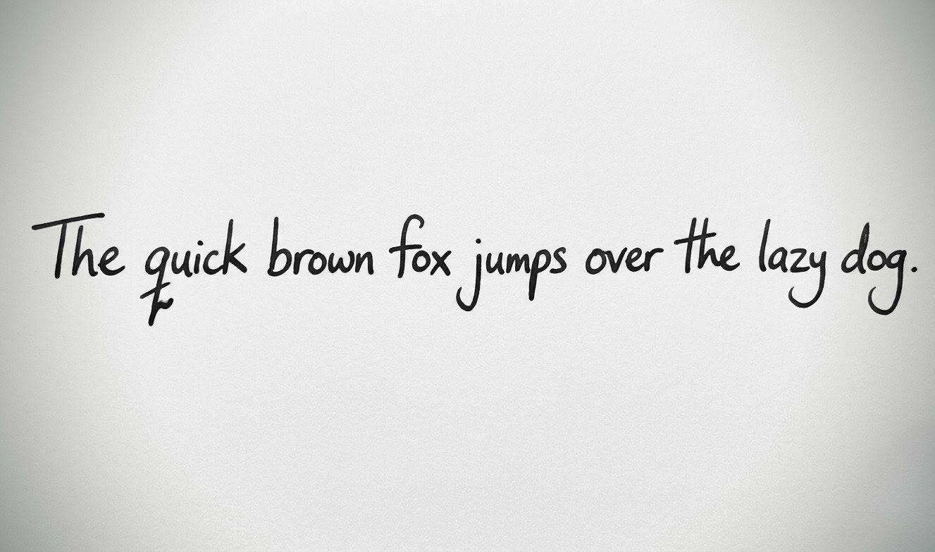
How Are Fonts Made and How to Make Yours
You've typed in Poppins a hundred times. Maybe Arial, Helvetica, or Tahoma too. But have you ever stopped to wonder how these fonts are made? Like, where do those letterforms come from and how do they end up on your screen?
Here's how it works and a way to make yours at the end 😉
How Fonts Are Actually Made
1. It Starts on Paper (or a Tablet)

Every font begins as drawn letterforms. Type designers sketch each character, every curve, stroke, and look is drawn out.
2. Vectorization

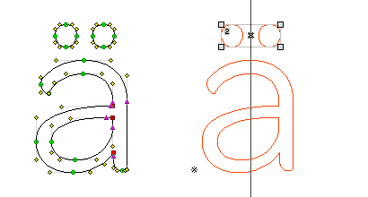
The sketches get digitized into vector outlines usually in tools like Glyphs App, FontForge, or RoboFont. Each character (called a glyph) is made up of anchor points and bezier curves.
This is why fonts scale perfectly at any size. They're mathematical curves, not pixels.
3. Spacing & Kerning
Once the glyphs are drawn, the designer sets:
- Advance width — how much horizontal space each character occupies
- Kerning pairs — custom spacing adjustments between specific letter combinations (like "AV" or "To") that would look awkward with default spacing
This step takes a while and often takes longer than drawing the letters themselves.
4. OpenType Features
Modern fonts are packaged as OpenType (.otf) or TrueType (.ttf) files. Inside, designers can encode features like ligatures (when two letters merge into one glyph — think "fi" or "fl"), stylistic alternates, small caps, and contextual substitutions. This is what separates a basic font from a variable one (like Robinco)
How to Make Yours
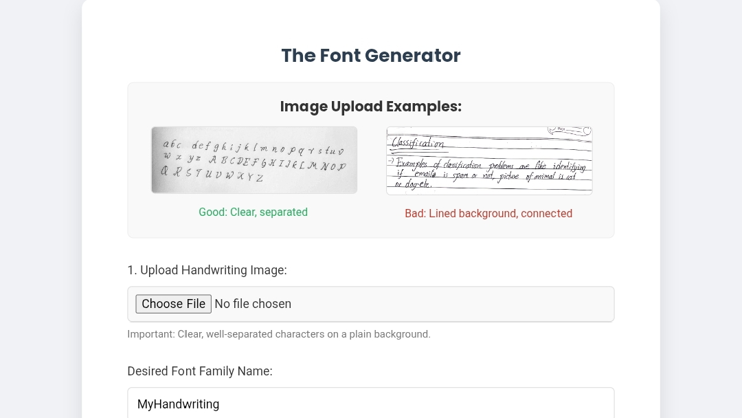
All these technicalities are for the pros. You don't have to do any of that to create yours. HandFonted makes it pretty straightforward.
Write out your characters on plain white paper with a dark pen, snap a photo, and upload it. Their AI detects and segments each character, converts them to vector glyphs, and gives you a .ttf file ready to install. No templates, no signup, no fuss. Works in Photoshop, MS Word... everywhere.
Tips to Get a Good Result
- Use a dark pen or felt-tip — Ballpoints are too faint and the AI will struggle
- Leave space between characters so the tool can tell them apart properly
- Write clearly and cleanly - This makes it easier to get your handwriting font better.
Share this post
Poppins, Arial, Montserrat,Tahoma... How are these fonts made? Here's a breakdown and an extra tip on how to make yours easily
Related Posts
-
How AI Image Generation Fits Into My Design Workflow
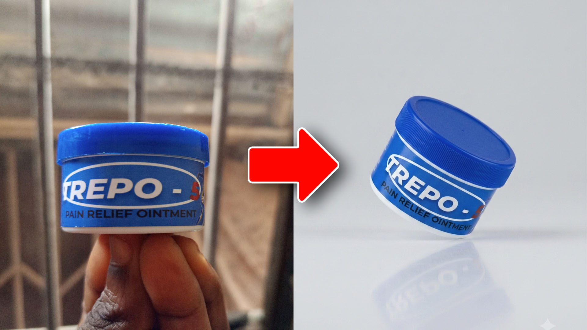
A quick look at how AI image generation speeds up creative work, using a real before-and-after example and the simple prompt behind it.
Jul 23, 2026 -
What I Finally Understood About Graphic Design
The biggest improvement in my designs didn't come from learning Photoshop. It came from asking one simple question before I started designing.
Jun 15, 2026 -
What I Didn't Understand About Graphic Design
For years, I thought graphic design was about making things look cool. The result was cluttered, confusing designs and a lesson that changed how I see design today.
Jun 8, 2026